Showing posts with label greetings. Show all posts

Saturday, November 26, 2016

Wedding invite

Had the pleasure of designing this wedding card. Since we were on a shoestring budget for this one, the concept had to be strong enough to make it stand out.
We chose the heart symbol and played with it for various stages of invites that were sent out. Here's a glimpse.


Tuesday, January 29, 2013

A series of Dreams : Swapna Shrinkhala


Originating in a mythological tale in Jainism here is a series of dreams we illustrated for some stunning calendar art this year :)

Wednesday, January 4, 2012

Devadruma : Divine forest splendour


After much contemplation on the theme for this year's much awaited calendar that we designed for the Kalpataru group it was "Devadruma" we settled for.

'Devadruma' is not a dictionary word, it comes from 'Dev' thats means God and 'Druma' which means vegetation in sanskrit; in summation these are mythological stories woven around trees considered sacred in India. A subtle hidden motive of using this theme on trees also was to to constantly remind the viewer of the name of the company i.e. Kalpataru, which means a wish granting tree, all through the year.

Here are some glimpses of the front and the corresponding backside of some months.


We had super fun digging for these tales that are not available in a book or on the web but have actually been passed on since centuries by word of mouth from generation to generation. Illustrating the same through a mixed medium started on an experimental note using watercolour and textures and we are happy with the results.

So here's wishing you a great year ahead!

Sunday, January 2, 2011

Sumangal 2011

When approached to design a calendar for 2011 for the Kalpataru group this year, we were delighted to be a part of this journey once more.

The group is well known for it's premium quality and style of construction. India-centric themes have been the highlight of these calendars for many years giving the group a profile that it is also rooted in culture, which is well received and appreciated. It is hence challenging to conceptualise a theme that is equally evocative and stunning year after year to bewilder the audience. However we all were keen to experiment as we did the previous year. And after a few rounds of internal brainstorming, meetings and presentations we were able to focus on a still broader concept, that was - symbols of prosperity in India.

We called it Sumangal 2011 - Painted prayers from folk India.


Research on this subject broadly indicated that the meaning of these symbols emerges from various faiths/beliefs from different regions of India with an unmistakable folk flavour. And hence came the inspiration for the rendition of these symbols in various Indian folk styles of expression.

We narrowed down to studying various "wall paintings" as they seemed an apt subject for our client, who's primary business is that of real estate. As we looked more and more we understood that these were not mere symbols for the artisan painting it but almost silent prayers of well being. And hence we got a title for the theme.


Some initial sketches and scans

Here is a glimpse of the calendar copy that has just arrived at the studio.


The calendar comes with a bookmark and pocket calendar. We opted for a red foil stamping for the title only. Otherwise appearing black it magically reflects the red sheen against light. Against an earthy rustic background, it adds richness. A similar feel is created onto the calendar flyleaf inside.

Each leaf inside has been given a special touch using various different inks and printing techniques to give the hand painted illustrations more volume.


Thermography in white on the shankh imitates rice paste.


Florescent green ink in leaves of the kalpavriksh lends extra freshness


Thakur ka ghar beautifully encases the deity in the house through Sohrai painting


Abrasive UV on a yantra gives it a tactile feel giving power each time it is touched


The kamal motif in lippan kaam imitates the mirror work See process


The surya spreads its radiance in a PVC Gold screen.


A moradi or peacock guards the walls of the meena tribe from rajasthan


A cluster of ten fish or matsya bless for good luck in marriage


A mrig or a deer symbolising man in harmony with nature


The seat of the rajput warrior on an elephant sparkles with gold foil stamped embellishments


The dharmachakra spreads the wisdom rendered in tibetian wall art style with effects imitating wood through a special UV


The magical spectre of the tarpa nritya captured with silver screen for the trees

With each of these folk symbols resting on its owner's desk we hope it brings them good fortune all round the year.

Friday, November 12, 2010

Diwali Greetings Design


: Designed for Kalpataru Group :


: Designed for DesignMembrane :


: Designed for Square Foot, Classic Floorings Pvt. Ltd. :

Diwali, the festival of lights has just gone by and we are just back from a short vacation too. Would like to share some festive greetings that we had fun designing.

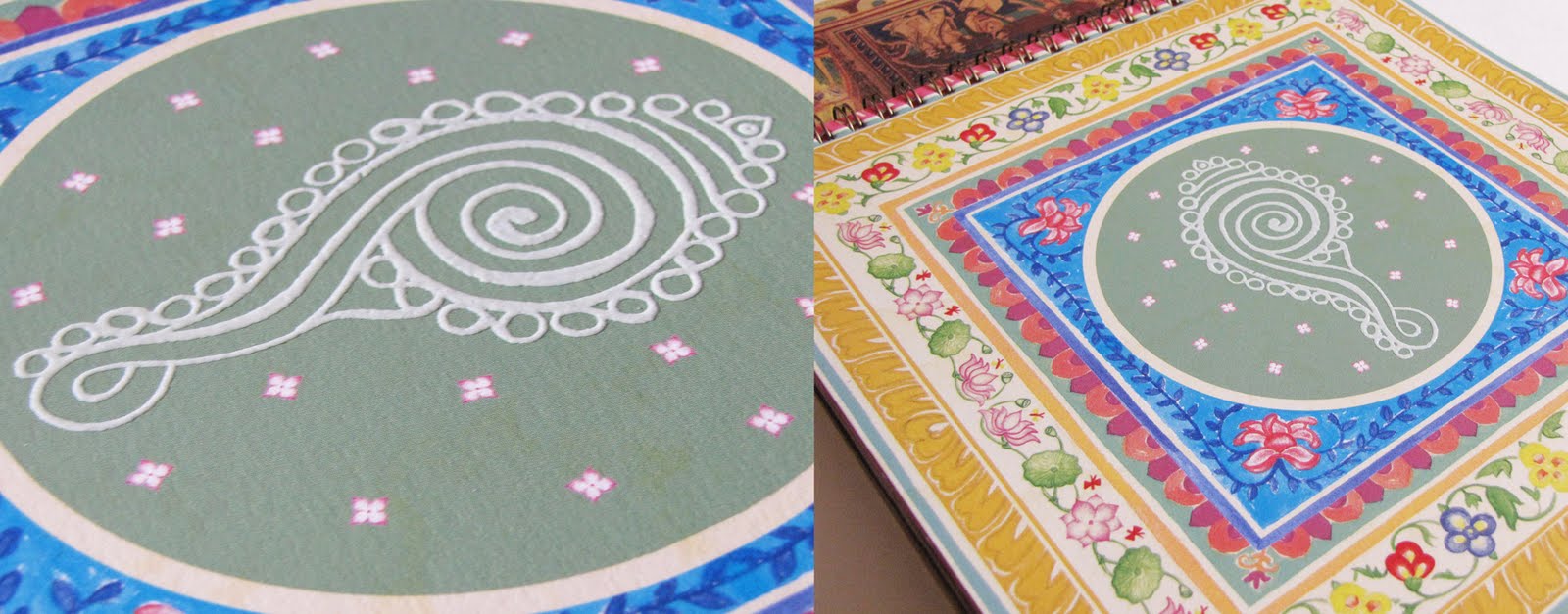
Based upon a mythological story - Lakshmi, the goddess of wealth emerges from the churning of the ocean with the kalpavriksh. Designed for the Kalpataru group. The illustration style is inspired from the stencil art of Mathura, India called Sanjhi. The message inside is a salutation to the goddess lakshmi in sanskrit delicately calligraphed by hand and refined on Adobe Illustrator. This is how the card took shape...


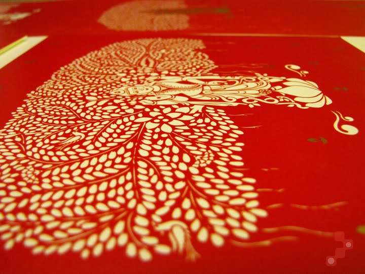
We had the chance to do some post production experimentation with printing on this one. Though we would have loved to have the main image in gold foil and embossed, there was little time to do so. We experimented with printing in PVC gold, keeping the colour combination a simple red and white and also in thermography to give it a raised feel.


------------------------------------------------------------------------

Our card this year was simple, wishing everyone prosperity(lotus-symbolic of goddess lakshmi) and enlightenment(diya or lamp). As it works both ways(up and down) it is subtly symbolic of the fact that the key to life is about maintaining a fine balance; prioritizing between acquiring wealth and enlightenment - both means to prosperity!


------------------------------------------------------------------------

Diwali, literally means a line of diyas. And on this simple concept was based our design for Square Foot - a flooring company. We chose the brand colours itself for better retention and recall of the brand itself to whoever received the greetings. The line inside in Sanskrit - "Tamaso mah Jyotirgamaya" translates as "may light prevail over darkness".

Do hope you had a sparkling diwali night as well :)