
Showing posts with label indian folk art. Show all posts
Showing posts with label indian folk art. Show all posts
Saturday, April 9, 2016
Thursday, May 14, 2015
To Rishabh and Vanshika
Designed these cards for a wedding in close family. The events were all held in the beautiful Suryagarh, Jaisalmer, Rajasthan.


The illustration style has been kept similar to the folk art found on the walls of Shekhavati called Bhittichitra. The lazer-cut jaali, the colour scheme and motifs are all inspired from Rajasthan.


The illustration style has been kept similar to the folk art found on the walls of Shekhavati called Bhittichitra. The lazer-cut jaali, the colour scheme and motifs are all inspired from Rajasthan.
Wednesday, February 4, 2015
All new Baaya

Baaya is a place where design meets all forms of Indian folk art. Here one would find traditional Indian art with a contemporary and functional twist. As Baaya's founder and CEO, Shibani Jain looks into every intricate detail that is being given to the brand new and awesome store space at Lower Parel in Mumbai one can see that it is indeed her labour of love. In her words, "Baaya is the Indian weaver bird that weaves its nest in a unique manner. It stands for a beautifully crafted yet functional space. The bird creates its nest, strand by strand, with many days of effort. The suspended nest takes on a beautiful, organic shape, rather like a mother’s womb. This amazing creation is our inspiration!"

Almost six years back we were commissioned to design a logo for the venture that was then taking wings. Now with a fresh new store space and newer horizons it was important to reconsider the visual language. While working on the identity we started with a fresh approach for an all new look initially. Here a quick look at the process.
We took two approaches, one was to keep it to an ethnic yet contemporary feel and the other route was a contemporary and modern look.

The nest represents an exotic form, a comfortable space/home. The bird perching on top in a commanding stance.

The nest is glorified and the tiny bird is integrated into the logotype.

The "b" initial shaped like the weaver bird's nest and "y" takes the shape of the bird.


However as we progressed it was clear that the old logo had left a mark on its existing customer base and associates. Hence we cleaned it up and defined the overall look for brand Baaya.


Here's hoping that the tiny bird finds it's way in everybody's heart!
Sunday, January 2, 2011
Sumangal 2011
When approached to design a calendar for 2011 for the Kalpataru group this year, we were delighted to be a part of this journey once more.
The group is well known for it's premium quality and style of construction. India-centric themes have been the highlight of these calendars for many years giving the group a profile that it is also rooted in culture, which is well received and appreciated. It is hence challenging to conceptualise a theme that is equally evocative and stunning year after year to bewilder the audience. However we all were keen to experiment as we did the previous year. And after a few rounds of internal brainstorming, meetings and presentations we were able to focus on a still broader concept, that was - symbols of prosperity in India.
We called it Sumangal 2011 - Painted prayers from folk India.

Research on this subject broadly indicated that the meaning of these symbols emerges from various faiths/beliefs from different regions of India with an unmistakable folk flavour. And hence came the inspiration for the rendition of these symbols in various Indian folk styles of expression.
We narrowed down to studying various "wall paintings" as they seemed an apt subject for our client, who's primary business is that of real estate. As we looked more and more we understood that these were not mere symbols for the artisan painting it but almost silent prayers of well being. And hence we got a title for the theme.

Some initial sketches and scans
Here is a glimpse of the calendar copy that has just arrived at the studio.

The calendar comes with a bookmark and pocket calendar. We opted for a red foil stamping for the title only. Otherwise appearing black it magically reflects the red sheen against light. Against an earthy rustic background, it adds richness. A similar feel is created onto the calendar flyleaf inside.
Each leaf inside has been given a special touch using various different inks and printing techniques to give the hand painted illustrations more volume.

Thermography in white on the shankh imitates rice paste.

Florescent green ink in leaves of the kalpavriksh lends extra freshness

Thakur ka ghar beautifully encases the deity in the house through Sohrai painting

Abrasive UV on a yantra gives it a tactile feel giving power each time it is touched

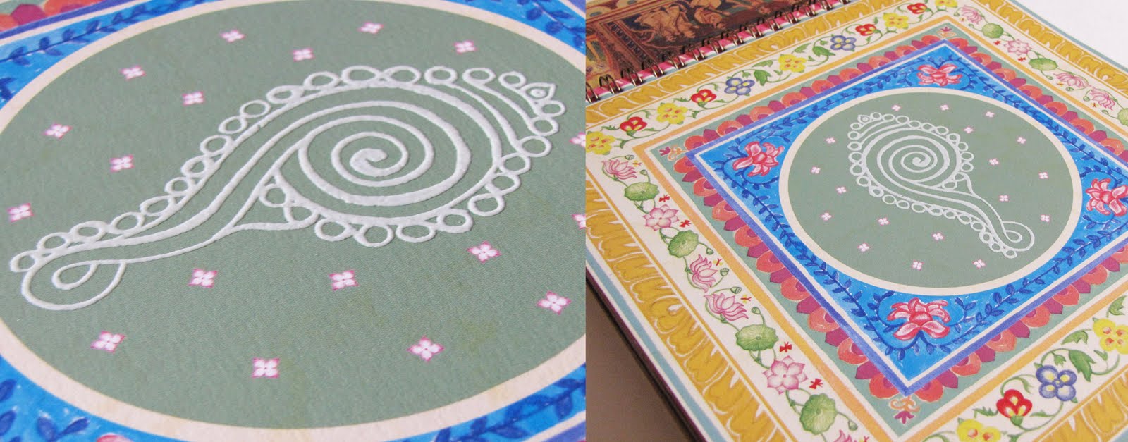
The kamal motif in lippan kaam imitates the mirror work See process

The surya spreads its radiance in a PVC Gold screen.

A moradi or peacock guards the walls of the meena tribe from rajasthan

A cluster of ten fish or matsya bless for good luck in marriage

A mrig or a deer symbolising man in harmony with nature

The seat of the rajput warrior on an elephant sparkles with gold foil stamped embellishments

The dharmachakra spreads the wisdom rendered in tibetian wall art style with effects imitating wood through a special UV

The magical spectre of the tarpa nritya captured with silver screen for the trees
With each of these folk symbols resting on its owner's desk we hope it brings them good fortune all round the year.
The group is well known for it's premium quality and style of construction. India-centric themes have been the highlight of these calendars for many years giving the group a profile that it is also rooted in culture, which is well received and appreciated. It is hence challenging to conceptualise a theme that is equally evocative and stunning year after year to bewilder the audience. However we all were keen to experiment as we did the previous year. And after a few rounds of internal brainstorming, meetings and presentations we were able to focus on a still broader concept, that was - symbols of prosperity in India.
We called it Sumangal 2011 - Painted prayers from folk India.

Research on this subject broadly indicated that the meaning of these symbols emerges from various faiths/beliefs from different regions of India with an unmistakable folk flavour. And hence came the inspiration for the rendition of these symbols in various Indian folk styles of expression.
We narrowed down to studying various "wall paintings" as they seemed an apt subject for our client, who's primary business is that of real estate. As we looked more and more we understood that these were not mere symbols for the artisan painting it but almost silent prayers of well being. And hence we got a title for the theme.

Some initial sketches and scans
Here is a glimpse of the calendar copy that has just arrived at the studio.

The calendar comes with a bookmark and pocket calendar. We opted for a red foil stamping for the title only. Otherwise appearing black it magically reflects the red sheen against light. Against an earthy rustic background, it adds richness. A similar feel is created onto the calendar flyleaf inside.
Each leaf inside has been given a special touch using various different inks and printing techniques to give the hand painted illustrations more volume.
Thermography in white on the shankh imitates rice paste.

Florescent green ink in leaves of the kalpavriksh lends extra freshness

Thakur ka ghar beautifully encases the deity in the house through Sohrai painting

Abrasive UV on a yantra gives it a tactile feel giving power each time it is touched

The kamal motif in lippan kaam imitates the mirror work See process

The surya spreads its radiance in a PVC Gold screen.

A moradi or peacock guards the walls of the meena tribe from rajasthan

A cluster of ten fish or matsya bless for good luck in marriage

A mrig or a deer symbolising man in harmony with nature

The seat of the rajput warrior on an elephant sparkles with gold foil stamped embellishments

The dharmachakra spreads the wisdom rendered in tibetian wall art style with effects imitating wood through a special UV

The magical spectre of the tarpa nritya captured with silver screen for the trees
With each of these folk symbols resting on its owner's desk we hope it brings them good fortune all round the year.
Subscribe to:
Comments (Atom)