DesignMembrane is a graphic design studio based in Mumbai, India led by Swati Chandak Sharma, an alumni of the National Institute of Design, India. We value design making an emotional connect and the relevance of context that adds volume to design. Through this blog we would like to share our stories and hope to generate a meaningful dialogue. Do get in touch if we could be of assistance in realising your vision.
Showing posts with label calendar design. Show all posts
Tuesday, January 29, 2013
Wednesday, January 4, 2012
Devadruma : Divine forest splendour
After much contemplation on the theme for this year's much awaited calendar that we designed for the Kalpataru group it was "Devadruma" we settled for.
'Devadruma' is not a dictionary word, it comes from 'Dev' thats means God and 'Druma' which means vegetation in sanskrit; in summation these are mythological stories woven around trees considered sacred in India. A subtle hidden motive of using this theme on trees also was to to constantly remind the viewer of the name of the company i.e. Kalpataru, which means a wish granting tree, all through the year.
Here are some glimpses of the front and the corresponding backside of some months.
We had super fun digging for these tales that are not available in a book or on the web but have actually been passed on since centuries by word of mouth from generation to generation. Illustrating the same through a mixed medium started on an experimental note using watercolour and textures and we are happy with the results.
So here's wishing you a great year ahead!
Sunday, January 2, 2011
Sumangal 2011
When approached to design a calendar for 2011 for the Kalpataru group this year, we were delighted to be a part of this journey once more.
The group is well known for it's premium quality and style of construction. India-centric themes have been the highlight of these calendars for many years giving the group a profile that it is also rooted in culture, which is well received and appreciated. It is hence challenging to conceptualise a theme that is equally evocative and stunning year after year to bewilder the audience. However we all were keen to experiment as we did the previous year. And after a few rounds of internal brainstorming, meetings and presentations we were able to focus on a still broader concept, that was - symbols of prosperity in India.
We called it Sumangal 2011 - Painted prayers from folk India.

Research on this subject broadly indicated that the meaning of these symbols emerges from various faiths/beliefs from different regions of India with an unmistakable folk flavour. And hence came the inspiration for the rendition of these symbols in various Indian folk styles of expression.
We narrowed down to studying various "wall paintings" as they seemed an apt subject for our client, who's primary business is that of real estate. As we looked more and more we understood that these were not mere symbols for the artisan painting it but almost silent prayers of well being. And hence we got a title for the theme.

Some initial sketches and scans
Here is a glimpse of the calendar copy that has just arrived at the studio.

The calendar comes with a bookmark and pocket calendar. We opted for a red foil stamping for the title only. Otherwise appearing black it magically reflects the red sheen against light. Against an earthy rustic background, it adds richness. A similar feel is created onto the calendar flyleaf inside.
Each leaf inside has been given a special touch using various different inks and printing techniques to give the hand painted illustrations more volume.

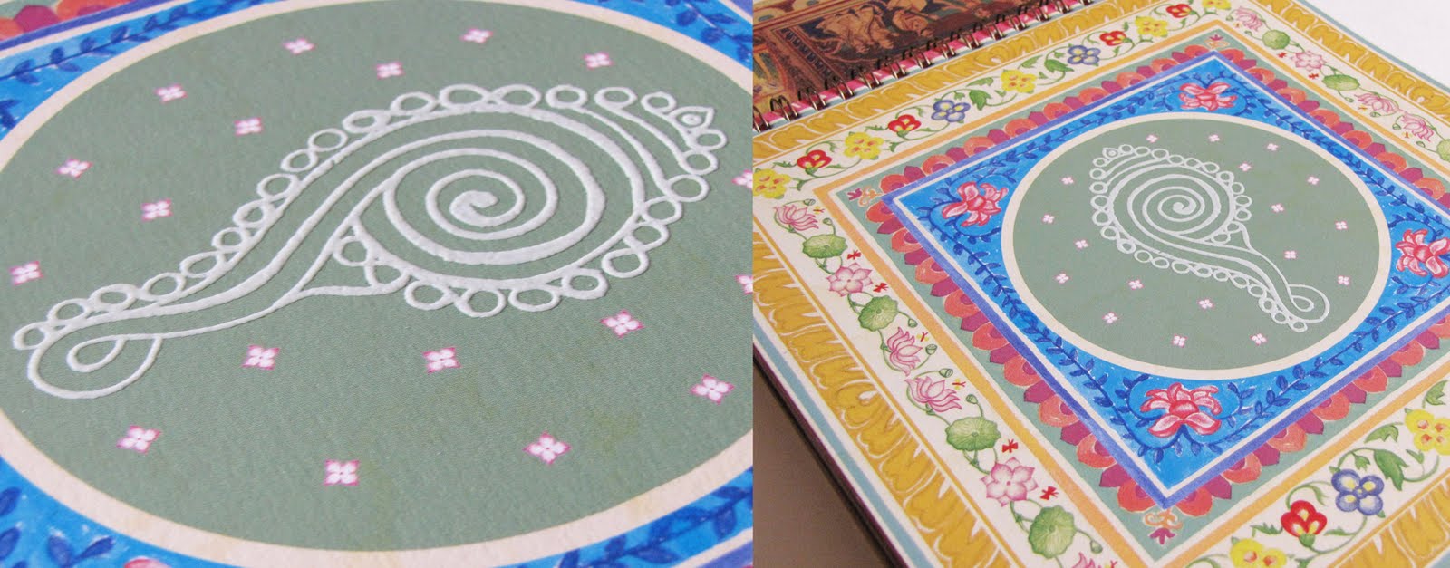
Thermography in white on the shankh imitates rice paste.

Florescent green ink in leaves of the kalpavriksh lends extra freshness

Thakur ka ghar beautifully encases the deity in the house through Sohrai painting

Abrasive UV on a yantra gives it a tactile feel giving power each time it is touched

The kamal motif in lippan kaam imitates the mirror work See process

The surya spreads its radiance in a PVC Gold screen.

A moradi or peacock guards the walls of the meena tribe from rajasthan

A cluster of ten fish or matsya bless for good luck in marriage

A mrig or a deer symbolising man in harmony with nature

The seat of the rajput warrior on an elephant sparkles with gold foil stamped embellishments

The dharmachakra spreads the wisdom rendered in tibetian wall art style with effects imitating wood through a special UV

The magical spectre of the tarpa nritya captured with silver screen for the trees
With each of these folk symbols resting on its owner's desk we hope it brings them good fortune all round the year.
The group is well known for it's premium quality and style of construction. India-centric themes have been the highlight of these calendars for many years giving the group a profile that it is also rooted in culture, which is well received and appreciated. It is hence challenging to conceptualise a theme that is equally evocative and stunning year after year to bewilder the audience. However we all were keen to experiment as we did the previous year. And after a few rounds of internal brainstorming, meetings and presentations we were able to focus on a still broader concept, that was - symbols of prosperity in India.
We called it Sumangal 2011 - Painted prayers from folk India.

Research on this subject broadly indicated that the meaning of these symbols emerges from various faiths/beliefs from different regions of India with an unmistakable folk flavour. And hence came the inspiration for the rendition of these symbols in various Indian folk styles of expression.
We narrowed down to studying various "wall paintings" as they seemed an apt subject for our client, who's primary business is that of real estate. As we looked more and more we understood that these were not mere symbols for the artisan painting it but almost silent prayers of well being. And hence we got a title for the theme.

Some initial sketches and scans
Here is a glimpse of the calendar copy that has just arrived at the studio.

The calendar comes with a bookmark and pocket calendar. We opted for a red foil stamping for the title only. Otherwise appearing black it magically reflects the red sheen against light. Against an earthy rustic background, it adds richness. A similar feel is created onto the calendar flyleaf inside.
Each leaf inside has been given a special touch using various different inks and printing techniques to give the hand painted illustrations more volume.

Thermography in white on the shankh imitates rice paste.

Florescent green ink in leaves of the kalpavriksh lends extra freshness

Thakur ka ghar beautifully encases the deity in the house through Sohrai painting

Abrasive UV on a yantra gives it a tactile feel giving power each time it is touched

The kamal motif in lippan kaam imitates the mirror work See process

The surya spreads its radiance in a PVC Gold screen.

A moradi or peacock guards the walls of the meena tribe from rajasthan

A cluster of ten fish or matsya bless for good luck in marriage

A mrig or a deer symbolising man in harmony with nature

The seat of the rajput warrior on an elephant sparkles with gold foil stamped embellishments

The dharmachakra spreads the wisdom rendered in tibetian wall art style with effects imitating wood through a special UV

The magical spectre of the tarpa nritya captured with silver screen for the trees
With each of these folk symbols resting on its owner's desk we hope it brings them good fortune all round the year.
Friday, September 3, 2010
Award for Kalpataru Desk Calendar 2010
We are glad to hear that "Dharohar" the desk calendar we designed for Kalpataru for 2010 has won the print-shop, Parksons Graphics an award for Printweek India Social Stationery Printer of the Year.
"The judges loved the Kalpataru Desk Calendar...The 13-leaf calendar with a flyleaf and envelope strictly followed the client’s instruction – use special effects solely for enhancement and not for inteference of the design. Such jobs are indicative of a printer’s role. Print is not merely reproduction. It is geared towards exploring ideas, techniques and design collaborations."
Congratulations to the brilliant job post-production!
"The judges loved the Kalpataru Desk Calendar...The 13-leaf calendar with a flyleaf and envelope strictly followed the client’s instruction – use special effects solely for enhancement and not for inteference of the design. Such jobs are indicative of a printer’s role. Print is not merely reproduction. It is geared towards exploring ideas, techniques and design collaborations."
Congratulations to the brilliant job post-production!
Sunday, January 10, 2010
Dharohar Continued
When a corporate turns 40 and has a legacy of its own it talks about the legacy of its soil at the turn of a new decade. A calendar design that was in process at DesignMembrane for the Kalpataru group is out now and we have received our copies to share in this space.


After a few rounds of theme presentations there was also a request from the client's end to develop and present on the theme of kings from different dynasties that ruled India in the past. We suggested a slight twist to it, listing down several dynasties from the first in the Vedic era to the era of post independence and seeking a derivative from each one. We knew each period would have some relevance in the present. For example, the Indian emblem came from the Mauryan times of Ashoka's pillar at Sarnath.
We called it "Dharohar", a sanskrit word that translates as "legacy".


Research was difficult initially. Our studio turned into a boring history class but with little chance of bunking it. But soon we were engrossed. It was not just about presenting the facts as is but somehow relating these with what we see around us today which is what made it interesting after all.
Soon ready with a moodboard for each month with all facts lined up with relevant images, a rough cut for the basic look and feel was also presented for the first three months so that the basic benchmark was set.
After loads of brain rattling, swapping one dynasty for another and eliminating a few, our basic theme and flow was set for the calendar (not necessarily in that order!). Our approach was a combination of pictures with illustration and we were also keen to later experiment with printing techniques but that was for later.
These dynasties with their respective legacies made it to the final cut...
*Mauryan legacy : Lion pillar-Emblem of India and the message of peace
*Cholas, Cheras and Pandyas' legacy : Dravidian architecture and a bureaucratic form of governance
*Satvahana legacy : First coinage
* Kushan legacy : The present form of Buddha
*Gupta legacy : Chess in its ancient form of Chaturanga and the beautiful cave paintings of Ajanta
*Pala legacy : First ever illustrated manuscripts
*Islamic Sultantes' legacy : The beautiful work of inlay from Bidar, Deccani painting
*Mughal legacy : The first rajput-mughal alliance:Jodha-Akbar and the message of love that emperor Shahjahan built for his beloved wife Mumtaz, the beauty of architectural forms and geometric patterns
*Rajputana legacy : Miniature paintings - Kishangarh's Bani Thani
*Maratha legacy : Shivaji's heroic tales and message of swarajya which also became the motivation behind the Indian Independence Movement
*British legacy : The Post, Railways and colonial painting
*Independent India : The spirit of freedom, National insignia - lotus, tiger and peacock
The calendar design breaks the routine perception of India often explored through kistch art forms. The photo-illustrations in a rather graphic manner aim to be both informative and evocative. Here are some pictures of the final print.

Mauryas - Indian Emblem form the Ashokan pillar in thermography to give a seal-like effect

Cholas, Cheras and Pandyas - The zari border in an imitation with screen printed gold motifs

Satvahanas - The symbol of their capital Ujjain, a cross with four circles at the ends screen printed in metallic copper

Kushans - The folds of the buddha sculpture can be felt with raised UV

Guptas - The pieces of the board game in foil

Palas - The stone wall in the background has a rough textured UV

Islamic Sultanantes - The Bidri metalware imitated with silver silk screen and foil stamping

Mughals - The emperors and their empresses in a spot UV

Rajputs - The motifs of the odhani replicated in an imitation of the real ones in gold silk screen

British - The imitation seal on the postal stamps in thermography

Independent India - The lighting on the Rashtrapati Bhavan and the motifs that represent the Indian insignia in glitter lamination to enthuse a feeling of celebration
Brilliantly printed and fabricated at Parksons Graphics, Mumbai. At our end, we kept a thumb rule of keeping "the effects" to the minimum and only in the front and not on the back side with the description text so as to not go overboard with it. All printing techniques were carefully selected for a single characteristic, only to add more meaning to the image and enhance the visual perception and sometimes add a dimension of touch, like in the folds of Gautam Buddha in the Dharohar of the Kushans.
Project Closure : Dec 2010


After a few rounds of theme presentations there was also a request from the client's end to develop and present on the theme of kings from different dynasties that ruled India in the past. We suggested a slight twist to it, listing down several dynasties from the first in the Vedic era to the era of post independence and seeking a derivative from each one. We knew each period would have some relevance in the present. For example, the Indian emblem came from the Mauryan times of Ashoka's pillar at Sarnath.
We called it "Dharohar", a sanskrit word that translates as "legacy".


Research was difficult initially. Our studio turned into a boring history class but with little chance of bunking it. But soon we were engrossed. It was not just about presenting the facts as is but somehow relating these with what we see around us today which is what made it interesting after all.
Soon ready with a moodboard for each month with all facts lined up with relevant images, a rough cut for the basic look and feel was also presented for the first three months so that the basic benchmark was set.
After loads of brain rattling, swapping one dynasty for another and eliminating a few, our basic theme and flow was set for the calendar (not necessarily in that order!). Our approach was a combination of pictures with illustration and we were also keen to later experiment with printing techniques but that was for later.
These dynasties with their respective legacies made it to the final cut...
*Mauryan legacy : Lion pillar-Emblem of India and the message of peace
*Cholas, Cheras and Pandyas' legacy : Dravidian architecture and a bureaucratic form of governance
*Satvahana legacy : First coinage
* Kushan legacy : The present form of Buddha
*Gupta legacy : Chess in its ancient form of Chaturanga and the beautiful cave paintings of Ajanta
*Pala legacy : First ever illustrated manuscripts
*Islamic Sultantes' legacy : The beautiful work of inlay from Bidar, Deccani painting
*Mughal legacy : The first rajput-mughal alliance:Jodha-Akbar and the message of love that emperor Shahjahan built for his beloved wife Mumtaz, the beauty of architectural forms and geometric patterns
*Rajputana legacy : Miniature paintings - Kishangarh's Bani Thani
*Maratha legacy : Shivaji's heroic tales and message of swarajya which also became the motivation behind the Indian Independence Movement
*British legacy : The Post, Railways and colonial painting
*Independent India : The spirit of freedom, National insignia - lotus, tiger and peacock
The calendar design breaks the routine perception of India often explored through kistch art forms. The photo-illustrations in a rather graphic manner aim to be both informative and evocative. Here are some pictures of the final print.

Mauryas - Indian Emblem form the Ashokan pillar in thermography to give a seal-like effect

Cholas, Cheras and Pandyas - The zari border in an imitation with screen printed gold motifs

Satvahanas - The symbol of their capital Ujjain, a cross with four circles at the ends screen printed in metallic copper

Kushans - The folds of the buddha sculpture can be felt with raised UV

Guptas - The pieces of the board game in foil

Palas - The stone wall in the background has a rough textured UV

Islamic Sultanantes - The Bidri metalware imitated with silver silk screen and foil stamping

Mughals - The emperors and their empresses in a spot UV

Rajputs - The motifs of the odhani replicated in an imitation of the real ones in gold silk screen

British - The imitation seal on the postal stamps in thermography

Independent India - The lighting on the Rashtrapati Bhavan and the motifs that represent the Indian insignia in glitter lamination to enthuse a feeling of celebration
Brilliantly printed and fabricated at Parksons Graphics, Mumbai. At our end, we kept a thumb rule of keeping "the effects" to the minimum and only in the front and not on the back side with the description text so as to not go overboard with it. All printing techniques were carefully selected for a single characteristic, only to add more meaning to the image and enhance the visual perception and sometimes add a dimension of touch, like in the folds of Gautam Buddha in the Dharohar of the Kushans.
Project Closure : Dec 2010
Friday, January 8, 2010
2010 Calendar for Span
Span Group, is a Delhi based technology solutions provider for telecommunications and internet operations in India. We had the opportunity to design their calendar for 2010, this time again however on a very very short notice.
Last year we had focused on the solutions they offer in a rather graphic treatment. The brief this year was to have something fun and fresh as well as low on budget.
We almost had a blank canvas before us that made it challenging. So we recycled some vector graphics created this year for other projects that were unused and also created some new, changed the orientation to a portrait and presented to our client.

The outcome is fresh and is not completely company focused like last year. Its experimental and totally out-of-box for our client's image who never hesitates to try.


Digitally printed on german alabaster.
Project Closure : Jan 2010
Last year we had focused on the solutions they offer in a rather graphic treatment. The brief this year was to have something fun and fresh as well as low on budget.
We almost had a blank canvas before us that made it challenging. So we recycled some vector graphics created this year for other projects that were unused and also created some new, changed the orientation to a portrait and presented to our client.

The outcome is fresh and is not completely company focused like last year. Its experimental and totally out-of-box for our client's image who never hesitates to try.


Digitally printed on german alabaster.
Project Closure : Jan 2010
Friday, November 27, 2009
Dharohar
Wednesday, January 21, 2009
2009 Calendar for Span
Span Group, is a Delhi based technology solutions provider for telecommunications and internet operations in India. It was year ending and were called upon to design a table top corporate calendar. Apparently this was the first time that our client was eager to have a calendar designed and the brief was to have an art based theme. However after a few discussions and soaking in our client's profile we realised that they were doing path breaking work that was probably the first ever in India.
We made a list of solutions they provide and suggested to focus/feature these in the calender. It made a lot of sense in the given situation since each of the solutions were unique and Span was an upcoming company that needed promote its activities in its relevant circle of clients.
The basic essence of each solution became the context of the illustration for each month. Each month has a planner on the other side of the calender. Colour palettes for the winter months were a warm glow and those for the summer months were cooler hues.


Digitally printed at Inndus on Sunfine pearl white paper.

Project Closure : January '09
We made a list of solutions they provide and suggested to focus/feature these in the calender. It made a lot of sense in the given situation since each of the solutions were unique and Span was an upcoming company that needed promote its activities in its relevant circle of clients.
The basic essence of each solution became the context of the illustration for each month. Each month has a planner on the other side of the calender. Colour palettes for the winter months were a warm glow and those for the summer months were cooler hues.


Digitally printed at Inndus on Sunfine pearl white paper.

Project Closure : January '09
Subscribe to:
Posts (Atom)