Friday, November 12, 2010

Diwali Greetings Design


: Designed for Kalpataru Group :


: Designed for DesignMembrane :


: Designed for Square Foot, Classic Floorings Pvt. Ltd. :

Diwali, the festival of lights has just gone by and we are just back from a short vacation too. Would like to share some festive greetings that we had fun designing.

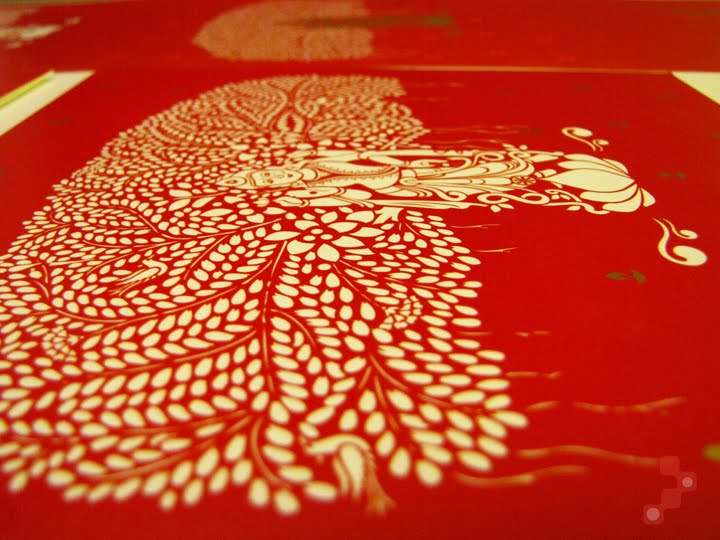
Based upon a mythological story - Lakshmi, the goddess of wealth emerges from the churning of the ocean with the kalpavriksh. Designed for the Kalpataru group. The illustration style is inspired from the stencil art of Mathura, India called Sanjhi. The message inside is a salutation to the goddess lakshmi in sanskrit delicately calligraphed by hand and refined on Adobe Illustrator. This is how the card took shape...


We had the chance to do some post production experimentation with printing on this one. Though we would have loved to have the main image in gold foil and embossed, there was little time to do so. We experimented with printing in PVC gold, keeping the colour combination a simple red and white and also in thermography to give it a raised feel.


------------------------------------------------------------------------

Our card this year was simple, wishing everyone prosperity(lotus-symbolic of goddess lakshmi) and enlightenment(diya or lamp). As it works both ways(up and down) it is subtly symbolic of the fact that the key to life is about maintaining a fine balance; prioritizing between acquiring wealth and enlightenment - both means to prosperity!


------------------------------------------------------------------------

Diwali, literally means a line of diyas. And on this simple concept was based our design for Square Foot - a flooring company. We chose the brand colours itself for better retention and recall of the brand itself to whoever received the greetings. The line inside in Sanskrit - "Tamaso mah Jyotirgamaya" translates as "may light prevail over darkness".

Do hope you had a sparkling diwali night as well :)

Friday, September 3, 2010

Award for Kalpataru Desk Calendar 2010

We are glad to hear that "Dharohar" the desk calendar we designed for Kalpataru for 2010 has won the print-shop, Parksons Graphics an award for Printweek India Social Stationery Printer of the Year.

"The judges loved the Kalpataru Desk Calendar...The 13-leaf calendar with a flyleaf and envelope strictly followed the client’s instruction – use special effects solely for enhancement and not for inteference of the design. Such jobs are indicative of a printer’s role. Print is not merely reproduction. It is geared towards exploring ideas, techniques and design collaborations."

Congratulations to the brilliant job post-production!

Friday, July 2, 2010

Measured Change -I

We are privileged to be a part of the team working on Change magazine, an in-house publication of Godrej & Boyce Mfg. Co. Ltd. and have been approached to take up its designing. The magazine has been in circulation for many years within Godrej and plays an important role to bind the conglomerate that has several businesses.

Godrej in India is a brandname we have grown up with. Rather synonymous with the iron almirahs and locks. As the new generation at Godrej takeover it is trying to strike a balance between the past and the future. With new ventures to allure the modern-young-urban Indian, Godrej has recently undergone an identity makeover by agency Interbrand.

While designing any piece of communication it is important to stick to the brand guidelines and the magazine is no exception. We at DesignMembrane have read through the extensive brand guide and hope to reflect a positive change!

As we play our part on this issue, would like to share the the cover design...

In each issue there is a theme in focus. The theme chosen is something of interest across sectors for all employees...usually strategy based, in which they discuss case studies so as to inspire employees of other units. There are other articles of general interest as well. For this issue the theme is "Chunks of Change". A strategy used for quicker results. Something that works like quicker short steps to the final goal.

This is the Change masthead.


The "G" symbol works effectively in conveying "refresh,recycle etc." As the word "Change" appears in the theme "Chunks of Change-Projects for Rapid Results" we took this as an opportunity to brand "Change" the magazine. Hence the cover illustration...


The "G" symbol from the masthead twirls for rapid results with the three brand colours.

Will share the story of the spreads and the rest in another post soon.

Sunday, January 10, 2010

Dharohar Continued

When a corporate turns 40 and has a legacy of its own it talks about the legacy of its soil at the turn of a new decade. A calendar design that was in process at DesignMembrane for the Kalpataru group is out now and we have received our copies to share in this space.


After a few rounds of theme presentations there was also a request from the client's end to develop and present on the theme of kings from different dynasties that ruled India in the past. We suggested a slight twist to it, listing down several dynasties from the first in the Vedic era to the era of post independence and seeking a derivative from each one. We knew each period would have some relevance in the present. For example, the Indian emblem came from the Mauryan times of Ashoka's pillar at Sarnath.

We called it "Dharohar", a sanskrit word that translates as "legacy".


Research was difficult initially. Our studio turned into a boring history class but with little chance of bunking it. But soon we were engrossed. It was not just about presenting the facts as is but somehow relating these with what we see around us today which is what made it interesting after all.

Soon ready with a moodboard for each month with all facts lined up with relevant images, a rough cut for the basic look and feel was also presented for the first three months so that the basic benchmark was set.

After loads of brain rattling, swapping one dynasty for another and eliminating a few, our basic theme and flow was set for the calendar (not necessarily in that order!). Our approach was a combination of pictures with illustration and we were also keen to later experiment with printing techniques but that was for later.

These dynasties with their respective legacies made it to the final cut...
*Mauryan legacy : Lion pillar-Emblem of India and the message of peace
*Cholas, Cheras and Pandyas' legacy : Dravidian architecture and a bureaucratic form of governance
*Satvahana legacy : First coinage
* Kushan legacy : The present form of Buddha
*Gupta legacy : Chess in its ancient form of Chaturanga and the beautiful cave paintings of Ajanta
*Pala legacy : First ever illustrated manuscripts
*Islamic Sultantes' legacy : The beautiful work of inlay from Bidar, Deccani painting
*Mughal legacy : The first rajput-mughal alliance:Jodha-Akbar and the message of love that emperor Shahjahan built for his beloved wife Mumtaz, the beauty of architectural forms and geometric patterns
*Rajputana legacy : Miniature paintings - Kishangarh's Bani Thani
*Maratha legacy : Shivaji's heroic tales and message of swarajya which also became the motivation behind the Indian Independence Movement
*British legacy : The Post, Railways and colonial painting
*Independent India : The spirit of freedom, National insignia - lotus, tiger and peacock

The calendar design breaks the routine perception of India often explored through kistch art forms. The photo-illustrations in a rather graphic manner aim to be both informative and evocative. Here are some pictures of the final print.


Mauryas - Indian Emblem form the Ashokan pillar in thermography to give a seal-like effect

Cholas, Cheras and Pandyas - The zari border in an imitation with screen printed gold motifs

Satvahanas - The symbol of their capital Ujjain, a cross with four circles at the ends screen printed in metallic copper

Kushans - The folds of the buddha sculpture can be felt with raised UV

Guptas - The pieces of the board game in foil

Palas - The stone wall in the background has a rough textured UV

Islamic Sultanantes - The Bidri metalware imitated with silver silk screen and foil stamping

Mughals - The emperors and their empresses in a spot UV

Rajputs - The motifs of the odhani replicated in an imitation of the real ones in gold silk screen

British - The imitation seal on the postal stamps in thermography

Independent India - The lighting on the Rashtrapati Bhavan and the motifs that represent the Indian insignia in glitter lamination to enthuse a feeling of celebration

Brilliantly printed and fabricated at Parksons Graphics, Mumbai. At our end, we kept a thumb rule of keeping "the effects" to the minimum and only in the front and not on the back side with the description text so as to not go overboard with it. All printing techniques were carefully selected for a single characteristic, only to add more meaning to the image and enhance the visual perception and sometimes add a dimension of touch, like in the folds of Gautam Buddha in the Dharohar of the Kushans.

Project Closure : Dec 2010

MindWave Identity


Our client is an IT facility management service provider besides which they also provide IT hardware sales and support who had earlier required an identity for MindSpark Infosolutions.

The brief for MindWave was to design a mark that was industrial-like and could be eventually placed over products as well.


We experimented printing with white ink on ivory card this time to achieve this water mark effect on the cards.


Friday, January 8, 2010

2010 Calendar for Span

Span Group, is a Delhi based technology solutions provider for telecommunications and internet operations in India. We had the opportunity to design their calendar for 2010, this time again however on a very very short notice.
Last year we had focused on the solutions they offer in a rather graphic treatment. The brief this year was to have something fun and fresh as well as low on budget.
We almost had a blank canvas before us that made it challenging. So we recycled some vector graphics created this year for other projects that were unused and also created some new, changed the orientation to a portrait and presented to our client.


The outcome is fresh and is not completely company focused like last year. Its experimental and totally out-of-box for our client's image who never hesitates to try.


Digitally printed on german alabaster.

Project Closure : Jan 2010

Friday, November 27, 2009

Dharohar


When a corporate turns 40 and has a legacy of its own it talks about the legacy of its soil at the turn of a new decade. A calendar design in process at DesignMembrane.
More coming up soon!

Monday, October 5, 2009

"A Family for Every Child" OUT NOW!!!


The book on all about adoption in India initiated by the Catalysts for Social Action is the new release from DesignMembrane now on stands at CrossWord and Oxford Book Stores all across the country.

Our cover girl is the beautiful Mohini, an adopted child who looks forward to a bright future . The launch at the CrossWord store at Kemps Corner, Mumbai was an apt beginning to the Joy of Giving week that has just come to an end.


DesignMembrane
is happy to support the cause of child adoption in this mini step.

The paperback in greyscale spreads and black and white photographs by Sameer Tawade has some very interesting articles on the subject by people from all walks of life who have had the wonderful experience of adopting, some celebrity adopters like Sushmita Sen (actor), Sandip Soparrkar (choreographer) and Raveena Tandon Thadani(actor) and adoptees with their perspective.


Project closure : September 2009

Monday, August 3, 2009

A FAMILY FOR EVERY CHILD

Catalysts for Social Action, a social welfare organization dedicated to the cause of child welfare is currently focused to influence change in adoption practice. We are honored to be associated with their initiative "A Family for Every Child" that will unveil at the Joy of Giving Week, 27th Sep-3rd Oct 2009.
We have designed the identity for this project which is also the name of the book.

Concept: 'A' for adoption, and 'A' completes a 'FAMILY'.
More updates on the book design and the rest soon.

Monday, May 25, 2009

M.I.C.E. Tourism Planner

"... the cradle of the human race, the birthplace of human speech, the mother of history, the grandmother of legend and the great grandmother of tradition. Our most valuable and most instructive materials in the history of man are treasured up in India."

-Mark Twain

India is in a continual process of upgrading its M.I.C.E. (Meetings, Incentives, Conferences & Exhibitions) facilities. There are multiple plans on the anvil for more world-class convention centers, airports that contest with the best in the world and efforts to team the famous Indian hospitality with customisation as per a visitor's requirement.
One such effort has been initiated by the India Convention Promotion Bureau sponsored by the Ministry of Tourism, the Government of India to launch a planner to list details on the M.I.C.E. destinations for 2009-10. DesignMembrane was approached by its marketing partner, Hotel and Food Service India Pvt. Ltd.(H&FS), Mumbai for design assistance on a publication that would be an exclusive showcase on the above.
Here are a few excerpts from the journal.


We designed the gate-fold cover like a teaser. The die-cut words by Mark Twain reveal a psychedelia of images from destination India underneath.


The opening page with scattered polaroids of the ten M.I.C.E. destinations with their defining landmarks and a spread from the India section.


The planner begins with a section broadly describing all about India, further leading into each city with a list of hotels, other accommodations, convention centers and auditoria preceded by pre/post convention information on what to do and when to come.


Designed with inputs from H&FS team and well printed at Krishna Art, Mumbai.

Project Closure : May 2009

Monday, May 11, 2009

studio site

The initial attempts of having a website of our own in order were simply not successful enough. So finally here's our brand new launch with the help of Muthu at Trigya who needs a big round of applause.
Happy browsing.

Tuesday, April 7, 2009

MindSpark Infosolutions

Our client is an IT facility management service provider besides which they also provide IT Hardware Sales and Support.

The logo construction aims to convey order, perfection and quality of service in the mark.

A clean, simple and straightforward logo mark for a company that deals with corporates on a day to day basis.