Thursday, May 14, 2015

To Rishabh and Vanshika

Designed these cards for a wedding in close family. The events were all held in the beautiful Suryagarh, Jaisalmer, Rajasthan.


The illustration style has been kept similar to the folk art found on the walls of Shekhavati called Bhittichitra. The lazer-cut jaali, the colour scheme and motifs are all inspired from Rajasthan.

Wednesday, February 4, 2015

All new Baaya


Baaya is a place where design meets all forms of Indian folk art. Here one would find traditional Indian art with a contemporary and functional twist. As Baaya's founder and CEO, Shibani Jain looks into every intricate detail that is being given to the brand new and awesome store space at Lower Parel in Mumbai one can see that it is indeed her labour of love. In her words, "Baaya is the Indian weaver bird that weaves its nest in a unique manner. It stands for a beautifully crafted yet functional space. The bird creates its nest, strand by strand, with many days of effort. The suspended nest takes on a beautiful, organic shape, rather like a mother’s womb. This amazing creation is our inspiration!"


Almost six years back we were commissioned to design a logo for the venture that was then taking wings. Now with a fresh new store space and newer horizons it was important to reconsider the visual language. While working on the identity we started with a fresh approach for an all new look initially.  Here a quick look at the process.

We took two approaches, one was to keep it to an ethnic yet contemporary feel and the other route was a contemporary and modern look.


The nest represents an exotic form, a comfortable space/home. The bird perching on top in a commanding stance.


The nest is glorified and the tiny bird is integrated into the logotype.


The "b" initial shaped like the weaver bird's nest and "y" takes the shape of the bird.


However as we progressed it was clear that the old logo had left a mark on its existing customer base and associates. Hence we cleaned it up and defined the overall look for brand Baaya.


Here's hoping that the tiny bird finds it's way in everybody's heart!

Wednesday, February 26, 2014

Accelya Hub


After a long pause from the studio here, there is a bit of an update. A few months ago we had wrapped up the identity design for Accelya. Since it was still under release we had to wait for disclosure and remove this post from here earlier.

However here is the story nonetheless!
As Accelya (a spanish co) and Kale (an indian co)  join hands for newer, better, bigger goals, it is the birth of an all new entity. Primarily the business here is to help airline customers streamline their financial processes. They also help them gain insights on business performance using decision support tools and data analytics.
The new brandmark for Accelya is a spark or an idea that emerges from a neuron-like network symbolic of the human expertise or intellectual capital. Coined as the HUB, it is the simplest and most efficient way to connect many origins to many destinations. Similarly "we" move, process and transform critical business information from its origin and convert it into actionable intelligence for stakeholders’ consumption.

The tagline “complexity simplified” brings forth not just our customer value proposition, but our attitude and approach to work.

The colour palette exudes warmth and personalisation - an extension of the human resource.

The logotype is constructed on the typeface Strada.


Tuesday, January 29, 2013

A series of Dreams : Swapna Shrinkhala


Originating in a mythological tale in Jainism here is a series of dreams we illustrated for some stunning calendar art this year :)

Wednesday, January 4, 2012

Devadruma : Divine forest splendour


After much contemplation on the theme for this year's much awaited calendar that we designed for the Kalpataru group it was "Devadruma" we settled for.

'Devadruma' is not a dictionary word, it comes from 'Dev' thats means God and 'Druma' which means vegetation in sanskrit; in summation these are mythological stories woven around trees considered sacred in India. A subtle hidden motive of using this theme on trees also was to to constantly remind the viewer of the name of the company i.e. Kalpataru, which means a wish granting tree, all through the year.

Here are some glimpses of the front and the corresponding backside of some months.


We had super fun digging for these tales that are not available in a book or on the web but have actually been passed on since centuries by word of mouth from generation to generation. Illustrating the same through a mixed medium started on an experimental note using watercolour and textures and we are happy with the results.

So here's wishing you a great year ahead!

Thursday, September 22, 2011

Annapoorna

We were a part of a great journey of developing an identity with an NGO that works in the area of providing a balanced, nutritious meal to young schoolgoing children. Unfortunately this never went into production, nonetheless would like to share the process here.

Brief : A simple and clean identity shall communicate the purity of thought, clean and quality food.
Brand archetype -
Innocent : wholesome, pure, trustworthy, honest, optimistic
Caregiver : selfless supportive, generous, nurturing, altruistic

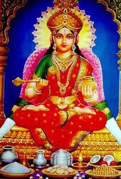
Process : After some internal discussions, the name Annapoorna was aptly chosen as it is the Indian goddess of nourishment.


Our initial thoughts were along these keywords or guides-

Food for the soul
Goddess Annapoorna’s golden pot and ladle
Health Pyramid
Pure and Fresh
Mother’s nurturing care
Food for growth
Serving and receiving
The Bowl of Compassion

These thoughts visually translated thus :


After discussing these with our client it was mutually agreed to pick the three directions that had potential and develop those further. After some more rework these were the qualifying ones :


However at this stage too, we still felt there was more that could be explored. The pot and the ladle concept was interesting but not there yet. The health pyramid needed a bit more to it. The mother's hand was just not it.

So we started looking for fresh ideas along with working further upon these ones...

The pot and the ladle went through a series of form corrections to make it look a little less forced and more comfortable visually.


It finally looked close.


The pyramid concept looked better integrated and proportionate.


Besides these, some more routes were developed.

+Motherly nutrition+


+Joy of Giving+


+Nutrition for Better Life+


+Motherly Love+


This is where the story of this project was left hanging and we wonder as we look back, if it was to be then which one would it be?

Wednesday, June 1, 2011

Folding up

Illustrations for a publication that we wanted to share in this space.


The theme was "The Big Change". It was interesting how the pneumonic went across a series of messages and extended the design concept. We certainly did enjoy executing this one!

Saturday, April 9, 2011

Measured Change-II


In a previous post sometime back I promised to share how the corporate journal for G&B called CHANGE would be coming along.

Here is a link to the e-journal from the godrej website.

This journal is a medium that unites the huge conglomerate that G&B is. A new theme is given to each issue in which all articles are written by the employees – for the employees and are broadly divided into two sections – the theme based followed by the home based. It is A4 size with 48 to 52 pages required a grid flexible enough to accommodate the varying lengths of articles. This journal also published in marathi language requires a common visual appeal that must carry the essence of the parent brand “Godrej” also mentioned in their detailed brand manual.

We were given two issues from the past to study and suggest how its shortfalls could be addressed.


As one would notice, the covers of the two issues we had were inconsistent in the use of the Godrej logo, the editorial got cropped with the flap closed and thin and inconsistent margins would make articles look text heavy.

Based on such analysis we approached a few sample articles, as varied in nature as possible. We made an initial presentation of our views and suggestions. This basically dealt with how margins and consistency of layout supported by a well-defined grid would work.

Once this was approved, a basic grid was set. It was important to address typography as we had observed too many type variations in the previous issues inspite of the brand manual's clear guides. It was important to set a font size for the heading. sub-heads and body copy particularly for this journal. We derived and defined this from the brand manual itself. A basic tone was set once illustrations began to shape in.

And here are some spreads to share from the issues we have designed.


The flap earlier with the team and the theme graphics seemed bulky so we narrowed it. The editorial column space was reduced so that it doesn't cut because of the flap sitting over


The theme graphics on the flap are always done such that they flow in well with the first article as well so that it doesn't look out of place even when opened along this way


The authors pictures in issues we attempted earlier did not appear in all articles so they were put as aesthetically fit-in the composition. However on the note that it gave the authors their minutes of fame and recognition it was decided to have their pictures in all articles. We feared it would make the pages mundane and leave no flexibility to add graphics to each article hence the grid was modified a bit to accomadate this.


Back covers of earlier issue (top). An attempt to standardize the back cover for each issue since it is a regular feature. Photo credit to the author also incorporated in the last issue(bottom)

We also do these issues in Marathi as well.

Do check the e-journal for a better view of the flow and also the latest issue. There are still many things to be addressed however when it’s a huge corporate such as this, we are collectively working with our client towards a gradual change!