
The 17th Convergence India recently concluded at Pragati Maidan, New Delhi. We were happy to see our work on the Span exhibition booth come up well.
We have also redesigned their new
website. Just to share the design process, this is how their website looked like when we were approached to redesign it.
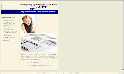
A long list of their areas of operation-10 links, vertically on the left and 7 links to different sections lined up horizontally on top. The Span Group on the top right was not required when the logo was placed on the top left corner itself. We felt the overall look of the site for a company that was doing pioneering work in the realm of telecommunications in India, was rather dull.


As we moved on to the pages further we realised that the content needed to be crisper. Also, the overall colour scheme of the site did not resonate with the Span logo. We obviously had to share these issues with the client after which they were convinced for a complete overhaul and were ready to cooperate with us on rebuilding the content.
We had only recently designed the
Span Calender and understood the need for a similar, cleaner and fresher look for the website as well. Since Span is into providing telecommunication solutions of a wide variety that they wanted to speak about on the home page itself, it became a challenging task. Clearly, for this website the two critical areas were the home page and the solutions page which had an intricate classification. We suggested that they make broad categories for these instead of listing 10-15 odd solutions together, just so that the page would look less cluttered and they could keep adding/removing more solutions/pages within these. This took care of the basic web structure. We disliked the idea of presenting a list for the solutions/areas of operation, so we thought of alternative ways of doing this task.


Emphasizing the Span purple, we made it look like an intricate section of a hard disk of sorts. However, this appeared cluttered and heavy on illustration and the eyes of the viewer.
We then suggested our client to come up with a basic sentence/para which would cover all their solutions that would work as keywords and an introduction to the company. We worked on it further and it became a perfect opening for the home page! Another option was presented with a lighter flat blue background and enhancing the spark element which is also a part of the Span logo. We also colour coded the solution categories in a family of pastel shades.


The Span "Spark" element was adding some bit of a noise to the otherwise clean layout so we decided to drop this.

In the meanwhile our client decided to drop the Span colour from a deep purple to a blue that added freshness.


The flat blue was then changed in favour of a blue gradient. It also adds contrast to the logo from the background blue. As per this layout we wanted to use the tab space on the left in the white area for the page/section titles. However as you can see, this did not work too well when one came into the solutions domain. Also, reading rotated type on screen can create legibility issues.

Finally, the Span home page still has all the many links but we have smoothly managed to conseal them! See the website
www.spantel.in for more.
Project Closure: March 2009


