Showing posts with label design process. Show all posts

Monday, March 19, 2018

Make Me Happy Salads


First time author Zarine Jalil from Salad Stories, tells simple and engaging children stories with cut fruits and vegetables and the viewers can eat it all up at the end of the session. This book is her first attempt at engaging the young audiences. It has many such fun rhymes and easy to do salads for parents and kids alike.


We design directed the cover and the spreads. It was a fun collaboration and we are very proud of the outcome. It is lovely to see children taking so much interest in this one of a kind book and also eating healthy at the same time.


Handlettering all the rhymes took a while but it was worth the wait and effort as it adds to the DIY feel of the book.

Sharing a few spreads here. 


The book is soon available at all leading bookstores near you. Couldn't be a better reason to pick your copy for a kid or for the kid in you.


Wednesday, February 4, 2015

All new Baaya


Baaya is a place where design meets all forms of Indian folk art. Here one would find traditional Indian art with a contemporary and functional twist. As Baaya's founder and CEO, Shibani Jain looks into every intricate detail that is being given to the brand new and awesome store space at Lower Parel in Mumbai one can see that it is indeed her labour of love. In her words, "Baaya is the Indian weaver bird that weaves its nest in a unique manner. It stands for a beautifully crafted yet functional space. The bird creates its nest, strand by strand, with many days of effort. The suspended nest takes on a beautiful, organic shape, rather like a mother’s womb. This amazing creation is our inspiration!"


Almost six years back we were commissioned to design a logo for the venture that was then taking wings. Now with a fresh new store space and newer horizons it was important to reconsider the visual language. While working on the identity we started with a fresh approach for an all new look initially.  Here a quick look at the process.

We took two approaches, one was to keep it to an ethnic yet contemporary feel and the other route was a contemporary and modern look.


The nest represents an exotic form, a comfortable space/home. The bird perching on top in a commanding stance.


The nest is glorified and the tiny bird is integrated into the logotype.


The "b" initial shaped like the weaver bird's nest and "y" takes the shape of the bird.


However as we progressed it was clear that the old logo had left a mark on its existing customer base and associates. Hence we cleaned it up and defined the overall look for brand Baaya.


Here's hoping that the tiny bird finds it's way in everybody's heart!

Wednesday, February 26, 2014

Accelya Hub


After a long pause from the studio here, there is a bit of an update. A few months ago we had wrapped up the identity design for Accelya. Since it was still under release we had to wait for disclosure and remove this post from here earlier.

However here is the story nonetheless!
As Accelya (a spanish co) and Kale (an indian co)  join hands for newer, better, bigger goals, it is the birth of an all new entity. Primarily the business here is to help airline customers streamline their financial processes. They also help them gain insights on business performance using decision support tools and data analytics.
The new brandmark for Accelya is a spark or an idea that emerges from a neuron-like network symbolic of the human expertise or intellectual capital. Coined as the HUB, it is the simplest and most efficient way to connect many origins to many destinations. Similarly "we" move, process and transform critical business information from its origin and convert it into actionable intelligence for stakeholders’ consumption.

The tagline “complexity simplified” brings forth not just our customer value proposition, but our attitude and approach to work.

The colour palette exudes warmth and personalisation - an extension of the human resource.

The logotype is constructed on the typeface Strada.


Thursday, September 22, 2011

Annapoorna

We were a part of a great journey of developing an identity with an NGO that works in the area of providing a balanced, nutritious meal to young schoolgoing children. Unfortunately this never went into production, nonetheless would like to share the process here.

Brief : A simple and clean identity shall communicate the purity of thought, clean and quality food.
Brand archetype -
Innocent : wholesome, pure, trustworthy, honest, optimistic
Caregiver : selfless supportive, generous, nurturing, altruistic

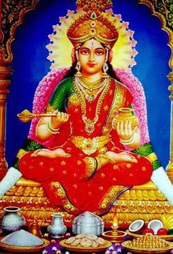
Process : After some internal discussions, the name Annapoorna was aptly chosen as it is the Indian goddess of nourishment.


Our initial thoughts were along these keywords or guides-

Food for the soul
Goddess Annapoorna’s golden pot and ladle
Health Pyramid
Pure and Fresh
Mother’s nurturing care
Food for growth
Serving and receiving
The Bowl of Compassion

These thoughts visually translated thus :


After discussing these with our client it was mutually agreed to pick the three directions that had potential and develop those further. After some more rework these were the qualifying ones :


However at this stage too, we still felt there was more that could be explored. The pot and the ladle concept was interesting but not there yet. The health pyramid needed a bit more to it. The mother's hand was just not it.

So we started looking for fresh ideas along with working further upon these ones...

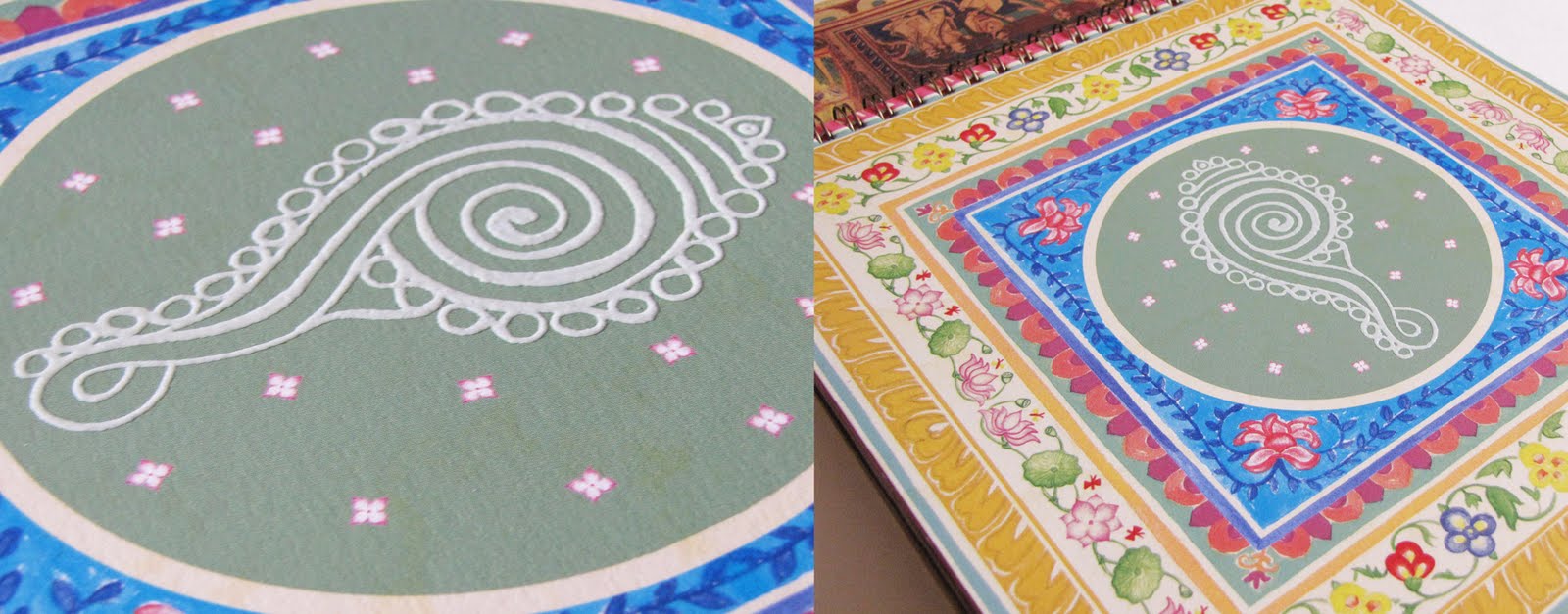
The pot and the ladle went through a series of form corrections to make it look a little less forced and more comfortable visually.


It finally looked close.


The pyramid concept looked better integrated and proportionate.


Besides these, some more routes were developed.

+Motherly nutrition+


+Joy of Giving+


+Nutrition for Better Life+


+Motherly Love+


This is where the story of this project was left hanging and we wonder as we look back, if it was to be then which one would it be?

Saturday, April 9, 2011

Measured Change-II


In a previous post sometime back I promised to share how the corporate journal for G&B called CHANGE would be coming along.

Here is a link to the e-journal from the godrej website.

This journal is a medium that unites the huge conglomerate that G&B is. A new theme is given to each issue in which all articles are written by the employees – for the employees and are broadly divided into two sections – the theme based followed by the home based. It is A4 size with 48 to 52 pages required a grid flexible enough to accommodate the varying lengths of articles. This journal also published in marathi language requires a common visual appeal that must carry the essence of the parent brand “Godrej” also mentioned in their detailed brand manual.

We were given two issues from the past to study and suggest how its shortfalls could be addressed.


As one would notice, the covers of the two issues we had were inconsistent in the use of the Godrej logo, the editorial got cropped with the flap closed and thin and inconsistent margins would make articles look text heavy.

Based on such analysis we approached a few sample articles, as varied in nature as possible. We made an initial presentation of our views and suggestions. This basically dealt with how margins and consistency of layout supported by a well-defined grid would work.

Once this was approved, a basic grid was set. It was important to address typography as we had observed too many type variations in the previous issues inspite of the brand manual's clear guides. It was important to set a font size for the heading. sub-heads and body copy particularly for this journal. We derived and defined this from the brand manual itself. A basic tone was set once illustrations began to shape in.

And here are some spreads to share from the issues we have designed.


The flap earlier with the team and the theme graphics seemed bulky so we narrowed it. The editorial column space was reduced so that it doesn't cut because of the flap sitting over


The theme graphics on the flap are always done such that they flow in well with the first article as well so that it doesn't look out of place even when opened along this way


The authors pictures in issues we attempted earlier did not appear in all articles so they were put as aesthetically fit-in the composition. However on the note that it gave the authors their minutes of fame and recognition it was decided to have their pictures in all articles. We feared it would make the pages mundane and leave no flexibility to add graphics to each article hence the grid was modified a bit to accomadate this.


Back covers of earlier issue (top). An attempt to standardize the back cover for each issue since it is a regular feature. Photo credit to the author also incorporated in the last issue(bottom)

We also do these issues in Marathi as well.

Do check the e-journal for a better view of the flow and also the latest issue. There are still many things to be addressed however when it’s a huge corporate such as this, we are collectively working with our client towards a gradual change!

Identity Design for H&FS


Change is inevitable and to adapt one must evolve.

To re-design the identity for H&FS, a 25-year-old organization that has been working in the hospitality sector, the challenge at hand was to also determine to what extent was this change acceptable to it's beneficiaries and stakeholders.

Their old logo, we felt lacked concept thought and precision. The initials H, F & S stand for Hospitality, Food and Service (the full form however they have seldom used as they prefer it short). Hence our initial attempt was to make a mark that would visually speak for their prime business activity.

This exercise eventually got our client to rethink this proposal and they went for a more character driven approach. We sat to pin-it together in words that could define this persona.

This lent itself to these directions.


These were primarily derivatives of the elements from the old logo. However only the last one amongst these seemed like a possible direction, as it was the maximum the client was willing to move away from the exisiting identity.

We explored with typography and zeroed in on these options.


However, determined to somehow create a mark that could stand by itself we have stretched it a tad bit more.


And the client is excited!

Working on the stationery. Will share in another post soon as soon as it arrives from the press.

Sunday, January 2, 2011

Sumangal 2011

When approached to design a calendar for 2011 for the Kalpataru group this year, we were delighted to be a part of this journey once more.

The group is well known for it's premium quality and style of construction. India-centric themes have been the highlight of these calendars for many years giving the group a profile that it is also rooted in culture, which is well received and appreciated. It is hence challenging to conceptualise a theme that is equally evocative and stunning year after year to bewilder the audience. However we all were keen to experiment as we did the previous year. And after a few rounds of internal brainstorming, meetings and presentations we were able to focus on a still broader concept, that was - symbols of prosperity in India.

We called it Sumangal 2011 - Painted prayers from folk India.


Research on this subject broadly indicated that the meaning of these symbols emerges from various faiths/beliefs from different regions of India with an unmistakable folk flavour. And hence came the inspiration for the rendition of these symbols in various Indian folk styles of expression.

We narrowed down to studying various "wall paintings" as they seemed an apt subject for our client, who's primary business is that of real estate. As we looked more and more we understood that these were not mere symbols for the artisan painting it but almost silent prayers of well being. And hence we got a title for the theme.


Some initial sketches and scans

Here is a glimpse of the calendar copy that has just arrived at the studio.


The calendar comes with a bookmark and pocket calendar. We opted for a red foil stamping for the title only. Otherwise appearing black it magically reflects the red sheen against light. Against an earthy rustic background, it adds richness. A similar feel is created onto the calendar flyleaf inside.

Each leaf inside has been given a special touch using various different inks and printing techniques to give the hand painted illustrations more volume.


Thermography in white on the shankh imitates rice paste.


Florescent green ink in leaves of the kalpavriksh lends extra freshness


Thakur ka ghar beautifully encases the deity in the house through Sohrai painting


Abrasive UV on a yantra gives it a tactile feel giving power each time it is touched


The kamal motif in lippan kaam imitates the mirror work See process


The surya spreads its radiance in a PVC Gold screen.


A moradi or peacock guards the walls of the meena tribe from rajasthan


A cluster of ten fish or matsya bless for good luck in marriage


A mrig or a deer symbolising man in harmony with nature


The seat of the rajput warrior on an elephant sparkles with gold foil stamped embellishments


The dharmachakra spreads the wisdom rendered in tibetian wall art style with effects imitating wood through a special UV


The magical spectre of the tarpa nritya captured with silver screen for the trees

With each of these folk symbols resting on its owner's desk we hope it brings them good fortune all round the year.